Carolina Skateboarding… A Logo
So the brief for this was; “Create a memorable logo, kind of like the Wu ‘W’ or the Rocca Wear ‘R’ “. A tall order, meant mainly for a blog/website, but simple and easily translated into one color Tee/sticker printing.
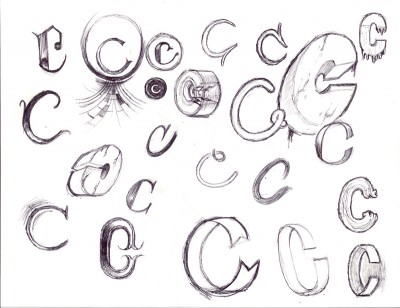
First some process, starting with hand-lettering, and then moving to the digital conception. When I first start with the hand-lettering I like to play with letter forms really freely to see if anything pops up that’s exceptional.

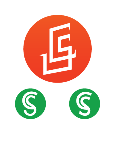
Moving to digital (in this case, straight to Adobe Illustrator), we’re looking for clean lines, or clear intent at least. If the lines are going to be rough anywhere they need to be rough for a reason. I stick with black and white in this stage of things to emphasize contrast and play with negative space and the balance of the different letter-forms.

And down to it, come up with this beauty. I was really stoked with the subtle play on dimensionality, what tricks your eye, like the facets of a pyramid or a steep bank-wall (obstacles that you might skateboard upon, for the uninitiated).

So what about skateboarding in the NC? It’s kind of a big deal. Wilmington is home to Eastern Skateboard Supply, one of the largest Skate/Surf distributors in the country. Check out the links below for your perusing pleasure…
Tags: Branding, branding and Identity, Logo, logo design, North Carolina, Skateboarding, Web Marketing